Today we’re going to discuss our raised panel wainscoting layout options, but first Happy Monday! Hope you had a great weekend. Aren’t you happy to be awake and at work? No? Me neither. Lisa and I haven’t had any real progress with our drawer slides yet, so I’ve decided not to post any more info on it until I get the hardware in-house and install it. It makes more sense than just going on and on about it. Once I finish it, I’ve got a lot to write about it.
In other news, I’ll be building a table for my workshop as well as a router table soon. I’m hoping to get working on the table during the week, but we’ll see.
We’re still working on the dining room plans. There are a couple decisions we need to make in addition to our configuration question. The first is the layout. I’ve come to the conclusion, that this is indeed the hardest part of the process.
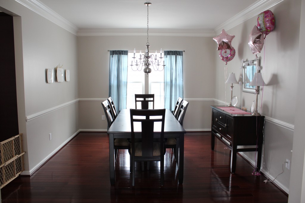
Here’s a reminder of what the room currently looks like:
Ok, so the wall on the right is the longest wall in the room. I’ll start my panel layout there. Apparently, an odd number of panels look the best. No problem. I can design a basic layout using an excel spreadsheet. The vertical pieces of the wainscoting I select to be 3.5″ wide and if I arbitrarily choose a number of panels, say 5 for example, I can calculate their widths. Computers make life easy here.
The problem arises when I try to stick with that panel width throughout the rest of the room. There are a couple small wall sections on either side of the window and below it as well. I can’t use the same panel width in those locations because those areas aren’t wide enough. But the big problem is the wall on the left. It has a doorway in it to the kitchen. I can’t use the panel widths I used on the right side wall on the left side without some redesign. It either ends up being too short for 3 panels or too wide with 4. Changing around the stile widths doesn’t give me a whole lot of room either. I’m stuck.
The way I see it, I have a few options to deal with it. Please give me your feedback as to what will look best. In terms of difficulty, there isn’t really any difference. It’s really all looks as this point.

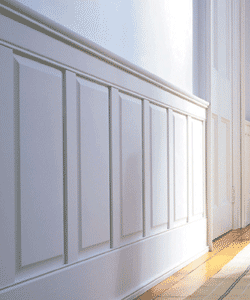
(Courtesy of New England Panel)
1. This is called the “Nothing to See Here Folks” plan. Use different panel widths on the left. This option let’s me take up the entire wall space on the left with whole panels. The difference in panel width from right to left may only be a couple inches, which may not be too noticeable. That result will look like something the first photo above.

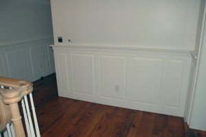
(Courtesy of Woodweb.com)
2. This is called “The Moving Wall” approach. Use two smaller panels on either side of two bigger panels. The photo above illustrates this option. This option adds some nice contrast, although it may look too busy and out of sorts if there aren’t any other similar patterns throughout the rest of the room.

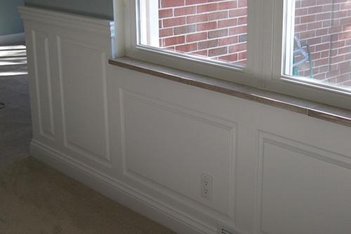
(Courtesy of Wainscoting America)
3. This is the “Just Deal with It” plan. The last option, as I see it, is to start the left wall out from the corner near the window and use the same sized panels as the right side. When I run out of real estate towards the kitchen door, I can just use one smaller panel as in the photo above.
Good options, all of them.
So, that’s what’s on my mind this week. Any dilemmas in your DIY life? Do anything exciting this past weekend?